
Click here to see about this trade mark !
English |
Japanese |
Japanese (By. Dr. Okabe) |
Click
here to see about this trade mark !
Last update: 2002.11.20
Color blindness is not a total loss of color vision. Color blind people
can recognize a wide ranges of colors. But certain ranges of colors are hard
to distinguish.
The frequency of colorblindness is fairly high. One in twelve Caucasian (8%), one in 20 Asian (5%), and one in 25 African (4%) males are so-called "red-green" colorblind. It is commoner than AB blood group.
There are always colorblind people among the audience and readers. There should
be more than TEN colorblinds in a room with 250 people. (50% male and 50% female)
There is a good chance that the paper you submit may go to colorblind reviewers.
Supposing that your paper will be reviewed by three white males (which is not
unlikely considering the current population in science), the probability that
at least one of them is colorblind is whopping 22%!
[ 22% = 1-(1-0.92)^3 ]
When preparing your presentations (papers, slides, web pages etc.), please take this into account. Here are some comments on how to make figures and presentations colorblind friendly.
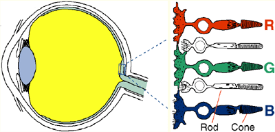
People sense colors by comparing the output of three types of cone cells. This is called trichromacy. The sensitivity spectrum of the red, green and blue cone cells overlap significantly, though. (See top left panel below.)
If the function of one type of the cones cells is lost, the person can still recognize fairly good variety of hues using the remaining two cone cell types. But certain range of colors, for example between red and green, becomes harder to distinguish. This is called dichromacy. (The remaining five panels.)
If the spectrum of a particular cone cell type is shifted, usually because of the mutation in a opsin gene, color vision becomes somewhat similar to the dichromatic person. This is called anomalous trichromacy. The degree how color vision is affected depends on where the mutation occurred in the gene. The color vision of some anomalous trichromacy people is as affected as a dichromacy people. Some are almost the same as non-colorblind.
The majority of colorblind is the so called "red-green colorblind," with problems either in the red or green opsin gene. People with mutant red opsin gene is called protanope, and green opsin gene deuteranope.
People with the problem in blue opsin gene is called tritanope. This is relatively rare, with only 0.001% of occurrence.
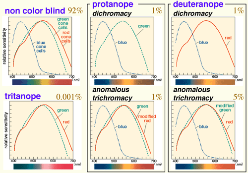
Fig 2 Types of colorblindness (with frequency among Caucasoid male)

Color vision of the red-green colorblind (protanopes and deuteranopes)
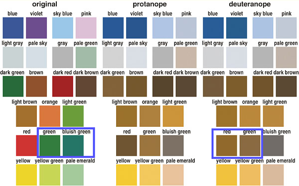
Color vision of the blue-yellow colorblind (tritanopes)
The biggest problem for the colorblind scientists (especially biologists) would be getting information from the fluorescent images.
With today's digital imaging system such as confocal microscopes, CCD cameras and array imagers, it is very easy to change the colors of each recording channel. When preparing for presentation, there is no reason to stick to the color you originally used for staining. Please choose the combination of colors that is most understandable to the audience.
Fluorescent double staining and DNA chips usually use red and green to show each channel. This causes two problems for colorblinds.
1: Impossible to understand which part is labeled with green and which part with red.
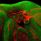
Fig 5 A typical fluorescent micrograph.
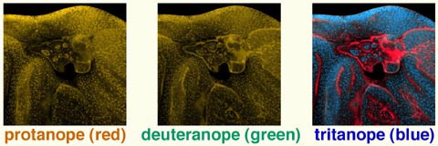
Fig 6 Simulation of how colorblinds see this picture.
2: Impossible to distinguish the region of "double positive." For colorblind people, yellow (red plus green) looks the same as bright green.
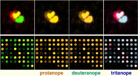
Fig 7 Above: Staining of two cells with labeled with one and two colors. Below: DNA chip with two colors.
Please use magenta (purple) instead of red. Magenta is the equal mixture of red and blue. Although colorblind people have difficulty recognizing the red component, they can easily recognize the blue hue. The region of double positive becomes white, which is easily distinguishable for colorblinds.
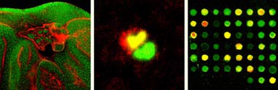
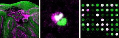
Fig 8 Red-green (above) and magenta-green (below)
version of the same pictures.
The conversion is very easy. Just copy the image of red channel to blue channel using image-manipuration software such as Adobe photoshop.
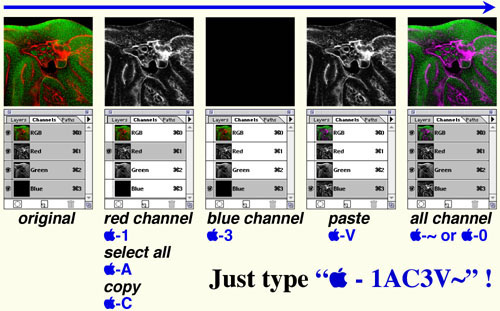
Fig 9 Conversion from red to magenta
Even images with single staining cause problem for colorblinds. Many people present such pictures with the color of the fluorescent dye used for the staining. But there are again two problems:
1: The pictures in pure red is hardly visible for the protanopes (see below for simulation). Even non-colorblind people feel difficulty seeing blue images.
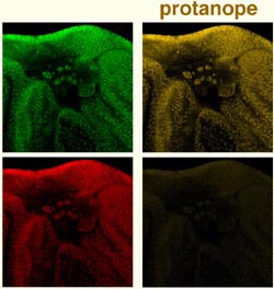
Fig 10 protanope simulation of single staining in green and red
2: Pure green and red are out of gamut (printable color range). Subtle gradation will be lost in the published paper. For example, bright greens are not printable. They are all converted to dull dark greens when printed, losing the information about signal intensity.
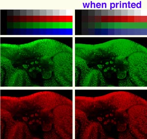
Fig. 11 Images with pure colors on screen (left) and when printed (right)
Thus, monochrome is the best for tonal reproduction. Can you convey more information by making it color? If you just want to show what kind of label you used (GFP, Cy3, etc.), a sentence in the figure legend might be enough.

Fig. 12 grayscale image
In case of staining with three labels,
1: Show grayscale pictures of each channel. (when distribution of each signal is interesting)
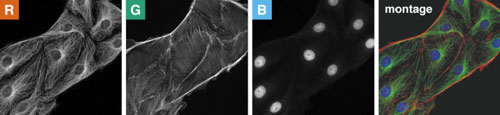
2: Show combinations of two channels in magenta and green. (when spatial correlation between channels is interesting)
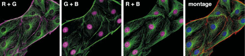
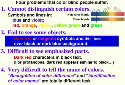
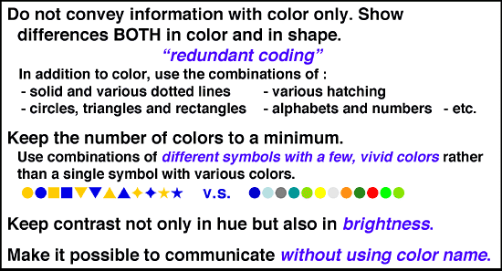
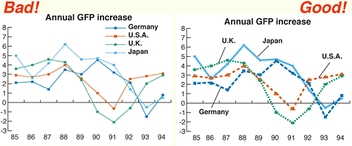
Fig. 14 Line drawings
Whereas the left graph use only color for coding, the left graph uses both color and shapes to differentiate different lines.
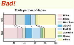
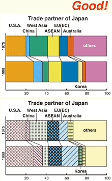
Fig. 15 Color fill
The top graph is coded only by colors. Since pale and unsaturated colors are chosen, it is difficult to distinguish different colors It is also difficult to describe the name of each color, making it difficult for communication. Readers are asked to compare the color of the graph itself with the separate keys. This is extremely difficult for color blinds.
The second graph is slightly better. The colors are more vivid and easier to identify. Separate keys are avoided so that readers no longer have to compare the colors of distant objects.
The bottom graph is the best. It uses not only colors but also various hatching. Each object is clearly distinguishable even without color vision. Again, this drawing does not lose any information when being faxed or copied.
This is applicable only AFTER you designed the figure with redundant coding. (See above)
Being friendly to colorblind people does not necessarily mean that one should not use colors. Even for the colorblinds, colors are very useful cues to distinguish different objects easily and quickly. By carefully selecting colors that are easily recognizable to people with all kinds of color vision, one can maximize the effect of her/his presentations.
1) Avoid the situation where important information is conveyed only in the
form of color.
2) Avoid the situation
where texts and objects are obscured with the background.
For example, there should be enough contrasts
in brightness and saturation between texts/objects and backgrounds. Avoid the
combination of colors that have the same brightness but different only in hue.
For example, red characters on green backgrounds is unreadable for colorblinds.
Use either bright texts/objects over dark backgrounds, or vice versa.
3) Make texts and objects as thick or big as possible.
When the size of color-coded objects is small,
only a few cone cells can be used for recognition. Colorblind people find it
especially difficult to distinguish the colors of thin lines and small symbols.
For color-coded text, use bold fonts such as Arial or Helvetica,
rather than thin Times or NewYork.
4) Caution when using red.
For non-colorblind people, red is the bright
and vivid color. But for colorblinds, it is as dull as blue or dark green. Especially
for protanopes, who cannot detect long wavelength of red light, dark red appears
almost as black. Thus, avoid using red characters on black backgrounds, including
blackboards.Note that black text and red text look the same for protanopes.
Colorblinds people, however, still feel certain ranges of reds as bright and
vivid colors. Instead of pure dark red (RGB=100%, 0%, 0% or #FF.) , please use
vermilion (yellowish red with shorted wavelength: RGB=100%,32%,0% or #FF2000), or light red (mixed with white: RGB=100%,8%,8%
or #FF1414).
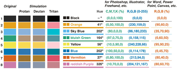
Fig. 16 Colorblind barrier-free color pallet
This is a proposal of color pallet that is
1: unambiguous both to colorblinds and non-colorblinds,
2: with vivid colors so that color names are easy to identify,
3: can be printable with similar color both on screen and when printed.
When combining colors from this pallet,
As shown in Fig. 4, the categorization of color does not match between colorblinds and non-colorblinds. Even for bright vivid colors, colorblind people cannot sometimes distinguish the name of colors. When explaining figures, avoid using only color names and describe also shapes or positions. For example, avoid saying "this red cell". Instead, say "this red, round cells on the top left", for example.
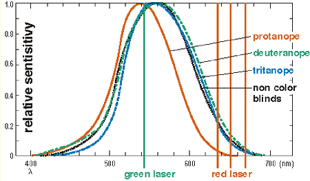
Fig. 17 Colorblind barrier-free color pallet
Since red laser pointers use long wavelength of light, it is often difficult for colorblinds to see where is pointed. Recently, green laser pointers becomes available, whose color is easy to see both for colorblinds and nom-colorblinds.
The light from one-milliwatt model is good for regular seminar room. A five-milliwatt model could be too bright except in a large auditorium.
You can simulate how your colorful images will appear for colorblinds. By combining "ImageJ" and "Vischeck ImageJ Plug-In", both of which are distributed freely, one can enjoy simulation on various platforms like Windows, Macintosh and Linux.
The simulation pictures in this web pages are all made by Vischeck. The software
simulates only the stronger form of colorblinds (dichromate), which is about
one fifth of the whole colorblind population. The remaining 80% are anomalous
trichromat, whose color vision phenotype is somewhere between dichromat and
non-colorblind.
How to install:
http://www.vischeck.com/downloads/vischeckJ/ReadMe_1.txt
Please feel free to use these items for your classes and
seminars. (Please don't forget, however, to mention Masataka Okabe and Kei Ito
for reference.)
| color_blind.pdf | How to make figures and presentations that are friendly
to color blind people -- Brochure with figures (PDF file, 2.6MB) |
| color_blind.ppt | -- as above PowerPoint file (9.4MB) |
We thank Cahir O'Cane and John Mollon (Cambridge Univ.) for useful discussion. We also thank Kazuo Ikeo, Michina Shiraki and Shigeo Hayashi (National Institute of Genetics), Masakazu Yabuuchi (Olympus Co. Ltd.), Tomoko Hashimoto and Maki Kimura (Total Media) for images and drawings. Suggestions from Kenji Kitahara, Makiko Ohkido (Jikei Medial School), Yasuyo Ichihara (Hosen Univ.) and Yosuke Tanaka (Tams) were extremely helpful. The barrier free trademark is designed and copyrighted by Kohei Musha.